Saw movie analysis


Saw is a 2004 American independent horror film directed by James Wan. The screenplay, written by Leigh Whannell, is based on a story by Wan and Whannell. It is the debut of Wan and Whannell and the first instalment of the seven–part Saw film series.
IMDB has identified this movie as a crime, horror and a thriller. It fits in with the crime and villain genre as alongside the scenes of the victims in the enclosed room there is a police investigation running alongside as a side story.
Classic horror themes are present. The hidden villain, the helpless victims, the dire situation.
Victim: Adam
Victim: Lawrence 
Heros: the police and investigation team
The 'hidden' villian: John Kramer (Jigsaw)


Setting - a really dark and isolated, dirty bathroom. Immediately the viewer recognises this is a horror film from the dark colours and dirty miserable surrounds, with paired with a deep, atmospherical score make it obviously horror. Using the cages and barbed wire signifies that the people are helpless, and it is playing on people's fears of being isolated and trapped/helpless.
Characters - a side character (Amanda) who is female is shown crying and troubled, which represents the stereotypical view that the female will be the victim, because she is helpless and weak.
Amanda appearing as the poor helpless victim.
However, this film challenges this by showing her defeating her 'game' and surviving on her own. In contrast the main male victims shown in the bathroom appear weaker, one having to injure himself to survive and the other not surviving at all.
Amanda defeating her 'game' and therefore opposing the female gender stereotype.
Amanda's character largely supports Carol Clover's idea of the 'gender fluidity of the 'final girl' which enables the female to be more easily identified with by the male audience. She is not shown as most females are in horror movies, with alot of flesh on show, dumb, helpless and mostly naked and sexually provocative. Instead, she appears as a tomboy, wearing little to no makeup, having masculine traits with most of the shots focusing on her face and not her body and is similar to an adolescent male.
Amanda appears dressed covered up in black and with her hair pulled back - 'final girl'
Yet, she still has a feminine name, which does oppose the theory that they usually have a unisex name, yet she still appears as the 'loner' type, and plays the role of Freud's 'castrated-male' theory. The film in this sense, (although mainly controlled by males) rebels against the one-dimensional female characters of the 70s and 80s, where they were objects of sexual objectification, and instead shows her more in light of the early 90's feminist positive image of a strong, independent female.

Props - various torture weapons and equipment represent pain and suffering to the victims, thus pushing further the horror genre. The doll creates fear by playing of people's fear of clowns. These collectively represent the horror genre so that the audience know what to expect from the movie.
Editing - a large amount of discontinuous editing creates a shuddering effect which doesn't allow the audience to get a complete understanding of what's going on. The use of the repetition of the line 'it;s your move' involves the audience, making them feel vulnerable, which is another key and common convention of horror movies.
The screenplay was written in 2001, but after failed attempts to get the script produced in Wan and Whannell’s home country, Australia, they were urged to travel to Los Angeles. In order to help attract producers they shot a low-budget short film from a scene out of the script. This proved successful in 2003 as producers from Evolution Entertainment were immediately attached and also formed a horror genre production label Twisted Pictures. The film was given a small budget and shot on a short schedule of 18 days.
Saw was first screened on January 19, 2004. Lionsgate picked up the rights and released the film in the United States and Canada on October 29, 2004. Critical responses were generally mixed and divided. Compared to its low budget, Saw performed very well at the box office, grossing more than $103 million worldwide and becoming, at the time, one of the most profitable horror films since 1996’s Scream. The success of the film prompted a green-light of a sequel soon after Saw’s opening weekend, which was released the following October.
Saw is mainly shot in one location, which is different to many other horror movies, as they often involve ‘chase’ scenes shot through multiple locations, involving movement. Saw has mainly one location, which I feel increases the claustrophobic, panic feeling to the movie. This also slows the movie down, stretching out the amount of time that the two main characters are trapped in the room, and it also makes the viewer focus more on the mental trauma that a main feature of the film, as the characters are torn between the decision of whether or not to hurt themselves to be free. The room which the majority film is shot in is grimy, unkept, dark and enclosed, which sets the base mood of the film as one of hopelessness and the feeling that there is ‘no way out’.
Throughout the movie there is flashbacks, giving the viewer hints of the past crimes of the victims, but also the killer. This gives a sense of foreshadowing to the movie, letting the viewer gather more information than the victims, which contrasts with the room scene, where the viewer is very much put in the character’s point of view.
Character's backstory is shown through flashbacks.

 This gives the viewer a sense of power, which is echoed through the movie as you get to learn the ‘value of life’ motive behind Saw’s killings, and gets to really connect with the killer, which is dissimilar to most horror movies, where the killer is almost behind a barrier, shown as an image, but not as a person.
Time is sped up during flashbacks, in which past death traps are shown, and this works to increase the sense of panic and horror in them. There is another type of flashback included; one from the viewpoint of the detectives, in which the dramatic mood is lessened by reducing the strong contrast between highlights and shadows that is used in the death scenes, and by slowing down time to a normal speed.
Time in the side story running alongside of the room sequence is played at a normal speed, with a normal tonal range to give a certain sense of contrasting calm.

The flashbacks are also used as another form of foreshadowing, letting the viewer know what’s about to come, and therefore building suspense, just waiting for the expected to happen. This is done by showing heightened scenes of traps, and then cutting to the still, calmness of the present tense trap scene.
In the dramatic moments, quick, short cut scenes are used to give a feeling of panic, desperation and threat to the sequence, which gets the heart pounding and the adrenaline flowing, putting you further in the shoes of the victim.
The movie also has a strong theme of the feeling of being trapped in one place, linking in with the fear of claustrophobia. In common society we are used to being able to go where we want, when we want, and having everything at our convenience. This therefore symbolises a much more common, but less typically ‘horror’ fear of not getting our own way, which is important in our selfish society.

Another fear is explored in this movie, with that being the fear of ‘the lesser of two evils’. An example would be in Saw 1, it is a choice between either dying in the enclosed room, or cutting through your own leg to escape. In common culture, we have grown used to having an easy option, or an easy escape route. The victims in this series of movies usually are likely to take the easy route out, and so the killer forces them to confront their wrong-doings.
The movie jumps straight into the story, placing two unknown strangers in a scene and pressing ‘play’. The audience knows nothing about the characters, their situation or how they have come to be there, so it gives an air of mystery, and makes the viewer want to know more, and to keep on watching. Their backstory is only given bit by bit, not letting the viewer see the full picture until towards the end. This means that the film is still able to deliver a twist. There is three ‘storylines’ running alongside each other; the present of the two characters in the trap room, the slow hints of their past, and the story of the detectives that are on the case. This way the audience gets to see multiple people’s point of view, so they feel more in control and more powerful, but actually they are not given much information about the main characters, so they actually hold a false belief.

Todorov's theory of the repetition of narrative structure applies in this film, as with most movies.
It differentiates from this theory by launching the audience straight into the event, with the first scene consisting of Adam and Lawrence (the two victims) waking up in the enclosed room, immediately followed by them recognising the fact that they have been abducted and are now trapped, and with the discovery of the audio tape that the villain has left for them, the film then consists of the victims attempting to fix the event by playing the 'game'. For these main victims, there is no starting equilibrium where everything is ok, or as normal.
Event
Debatable old equilibrium
An attempt to try and fix the event.
New equilibrium
However, in a side story of Amanda, another victim, this theory can be demonstrated, yet in a different way. It starts with the event, and then the audio tape describes the old equilibrium, how things were before, which then leads on to the recognition of the event and thus the attempt to fix the event. From this, it also applies to the main story, with Adam and Lawrence's own tape being the description of the old equilibrium, coming second after the event instead of first, as in Todorov's theory.
The audio tape which could be argued tells of the old equilibrium.
 The movie does end with a new equilibrium, which is different from the starting one, although not an entirely happy one, which shows the apparently dead man waking up from the floor and leaving the victim in the room.
After the new equilibrium, a flashback of the victims previous lives is shown, which could be argued to be the showing of the old equilibrium. I feel this works well, as it contrasts the end of the story with the beginning and what has caused them to come abouts this result.
All of Todorov's basic theories are included however in a slightly different order, which I feel works to keep the viewer on their toes by not revealing the whole of the backstory straight away and keeping them guessing and wondering.

German Expressionalism


An era of early German cinema (roughly 1910 to 1922) shows the first recognisable style of national cinema. The movement came about largely as a transition from WWI into the afterwar years, however it also contains elements form the long term German cultural mindset, especially the literary fascination with Gothic. The gothic style itself is focused around morbid subjects and dark influences, which translate to the horror theme well.
Expressionism is the movement in the fine arts, (including photography, moving film and manual arts) that emphasised the expression of one’s inner self and their angst rather than only being realistic and excited about the world and life. In this form, it is much deeper and more pessimistic. 
Expressionism was a reaction to impressionism which projected stark and absolute realities. Expressionists sought to reverse this trend in the arts and wished to portray allegorical worlds (world which represented something) which were in themselves metaphors for what people were experiencing at the time. Expressionists took the depression after the war, and translated this into the themes and moods of the films which they created at that time. Originally starting out as a movement in painting and sculpture it quickly spread to the fledgling movie industry in Europe where Expressionism had started. The majority of film expressionists came from the nation of Germany, hence why the term German Expressionism is so popular when describing this movement in film. However there were numerous film makers who conveyed Expressionist themes but were not German.
Germany at the time had just recovered from the consequences of World War I. Just like their fellow Germans, German Expressionists directors film felt disillusioned with reality and the world around them. As a result they made films that looked warped and distorted and were extremely surreal. German expressionist directors then toke their disillusionment one step further by having heavy and stark shadows, depressed/dark stories, and corruptible and untrustable characters. As many Germans had felt betrayed by their government when World War I had concluded many German Expressionist directors projected authority figures as villains to convey a sense of how no one could be trusted in the world they were living in. For example in the movie ’The Cabinet of Dr. Caligari‘ the main antagonist was a doctor. Thios is also reflected in true events; one being Hitler and how the German people believed in him, only for him to lead them to destruction.  Further coupled with their mise en scene direction, Expressionist directors wanted viewers to look beyond the characters on the screen and examine the world the characters were interacting in.
Stylistic elements taken from German Expressionism are common today in films that do not need reference to real places such as science fiction films.
Ambitious adaptations of the style are shown throughout the contemporary filmography of director Tim Burton. His 1992 film Batman Returns is often described as a modern attempt to capture the essence of German Expressionism. The angular building designs and severe-looking city squares of Gotham City evoke the loom and menace present in Lang’sMetropolis (1927 Expressionlist movie)
Burton’s influences are most apparent in the fairy tale suburban landscape of Edward Scissorhands. The appearance of Edward Scissorhands (not accidentally) reflects Caligari’s somnambulist (sleepingwalking) servant. Burton shows unease in his candy-colored suburb, and the tension is visually unmasked through Edward and his Gothic castle. Similarly, Dr. Caligari was the inspiration for the grotesque, bird-like appearance of ‘The Penguin’ in Burton’s 1992 film Batman Returns. Burton channels the Caligari nightmare with an inspired narrative branding, casting the garish somnambulist as the hero and the villagers as the villains.
Burton was also reportedly influenced by silent films and German Expressionism for his film adaptation of the musical Sweeney Todd: The Demon Barber of Fleet Street, describing the musical as a “silent film with music.

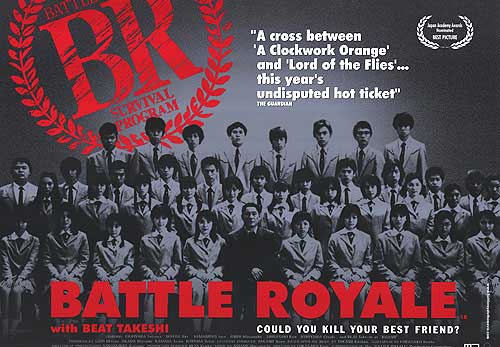
Battle Royale poster analysis


Battle Royale (バトル・ロワイアル, Batoru Rowaiaru?) is a 2000 Japanesethriller film, adapted from the 1999 novel of the same name by Koushun Takami. It is the final film directed by Kinji Fukasaku, was written to screenplay by his son Kenta Fukasaku, and stars Takeshi Kitano. The film tells the story of Shuya Nanahara, a high-school student struggling with the death of his father who is forced by the government to compete in a deadly game, where the students must kill each other in order to win. The film aroused both domestic and international controversy, and was either banned outright or deliberately excluded from distribution in several countries.
Battle Royale is not a film for the faint hearted, involving young teenagers killing one another, friends turning against friend, and a large amount of gore and blood. However, the poster is somehow calm and emotionless in comparison to the contents of the movie.
The poster is mainly in black and white, with dark shadows throughout, making the faces of the student unlegiable, removing personality from them, and therefore making the audience see them as ‘objects’. This connects with the contents of the movie, as the ‘show’ is broadcasted out to the general public, so they see them as not real people, but as figures for their entertainment. This dark shadows surrounding the students could also symbolise the darkness and potential lying within each one of them, as they are told to kill each other to survive. The colour black also symbolises death, evil and the unknown, possibly symbolising the student confusion at being thrust into the ‘game’. The only other colour used in this poster design is a vibrant red, which leaps off the page when paired next to the dark black tones. This colour is shown only in the typography, which tells you of the name of the movie and the logo of the ‘program’. This colour difference, greyscale for the students, red for the program, shows the difference in lives, desires and futures between the students at the time that the picture is taken, and the time which they will spend in the ‘Battle Royale’. The red colour look emposing, threatening and dominent, making it more powerful in this image that the photo, therefore drawing the eye first to this area and making it the main focal point. Red symbolises blood, violence, anger and hatred, which all are the key ideas of this movie, and so this symbolises this to the viewer increadibly well. They are left wondering what will happen to this innocent schoolchildren.
The largest component of this poster is the landscape image of the school children. I feel it is landscaped place as to accentuate the amount of them, and also to re-create the usual sitting of a typical school photograph. This image is a annual school photo, taken once a year, usually when Japanese students first start their year. I feel they have used this photo instead of one showcases the bloody horror of the film, as to capture a time when the students are together as a whole, united as one, like a team. To show them peacefully standing alongside one another, which therefore makes the horror of them killing each other even more shocking. It makes the viewer realise that they are just normal, non-insane teenagers, who did usual things until this twist of fate.
A stark white is used to highlight the text ‘Would you kill your best friend?’. This sentence is used to give the viewer a hint about the contents of the film, leaving them with a moral dilemma, which most people would answer as ‘no’. This therefore leaves the audience wondering why the poster is asking them this, and thus their mind connects them with the idea of friends killing friends, which both shocks them and intrigues them. All the font on this poster is in capital letters, and thus seems dominant and powerful, and also more masculine and so connects and attracts to the male audience more than the female. This must of been done as the general majority of horror movie viewers are male as opposed to female. The use of red could also be used to attract males, as red is used as a sexy colour in society, even though this movie contains no such content.

Devil's Rejects poster analysis


The Devil’s Rejects is a low-budget horror movie produced by rock musician Rob Zombie. I feel that this low-budget feel is translated through the move poster by the overtone of brown adding a dirty, poor theme to it, although this could also be linked with the film being set in the wild old west, so the brown therefore indicates age, dirt (the main characters are generally dirty) and also brown/tan is a common colour in that setting.
The poster is in the same tone as the ‘Wanted’ posters used in that era, which connects with the film as the main charactors, whose point of view the film is set from, are now wanted criminals for their actions. 
The story is a followup to the previous film House of 1000 Corpses, that chronicles an unstable texas Sheriff hunting a family of psychotic killers who previously murdered his brother and numerous other innocents in a western themed thriller.

The producer, Rob Zombie, could be said to be influenced by German-Expressionlist films, as his previous music video, ‘Living Dead Girl’ was highly influenced by ‘The Cabinet Of Dr. Caligari’, so this could have spread into his other works as an artist.
The poster itself shows a famous scene/positioning of the biblical scene ‘The Last Supper’. However, instead of the 12 disciples being positioned at the table, characters from the film are sat in the places instead, and instead of food spread out upon the table, torture tools, body parts and blood stains take the place instead. This connects with the name of the film ‘The Devil’s Rejects’ as this takes a Christian scene and turns it darker, giving almost a satanic feeling to it. This is also seen in the film, with the killers taking pleasure and deriving fun from the torturing and murdering of their victims, and also including several satanic symbols in the background of shots. 
A cloth is draped over only a section of the banquet table, placed sloppily and without care, which also is echoed in the dirty clothing of the characters featured in the poster. This connotes their uncaring nature towards their actions, and their impulsive nature, carrying out acts of torture without thinking about possible consequences. It also emphasises their hilly-billy nature and makes the viewer bias towards not liking the charactors. The poster also sets a negative image of the charactors by giving them guns, making them seem agressive.
However, this contrasts with the angle at which this shot is taken at. It has been taken at roughly the same eye-level as the subjects, which puts the audience on their level, making them seem more approachable, and aims to put the viewer in their ‘gang’. Overall, their body positions are generally open and confident, which could be taken as either welcoming or dominating  confronting. With the males in the image, it comes out as the latter. However, the female gives an air of ‘come get it’, with her laid back positioning and open body language, There is also a strong sense of the characters giving off a challenging vibe, daring them to come closer by clutching their weapons and holding eye contact.
The overall texture of the background is as if it has been coffee/tea stained, which I feel links in with the idea of age and how the criminals have been on the run for some time, and also the fact that in police scenes, they are always shown drinking coffee and so this could symbolize the amount of cups gone through in that time. Looking closer, the tone is darker around the charactors, as if they are radiating off a negative glow, which further links the idea into a pre-set negative idea of them. It says to the audience ‘we’re trouble’.
Overall, I think that this poster reflects the movie well. The poster has a sense of calm to it, appearing as a static shot, as opposed to the standard horror movie poster, which usually has a theme of action or threat or suspense. This poster is more like a portraiture of the murderers, and I also feel that the movie has a sense of calm to it, with the family taking pleasure and taking time in the killings.

Jennifer's Body poster analysis


Jennifer’s Body is a 2009 black comedy horror film written by Diablo Cody and directed by Karyn Kusama. The film stars Megan Fox, Amanda Seyfried, Johnny Simmons, and Adam Brody. Fox portrays a newly-possessed cheerleader who kills her male classmates, with her best friend striving to stop her. The film premiered at the 2009 Toronto International Film Festival and was released in the United States and Canada on September 18, 2009
The first thing that strikes me about this film is the cast line up of this film. The two main stars are Fox and Seyfried. Megan Fox is in common culture the main sex symbol of the moment, and in this film she is exactly portrayed as that; a siren. Seyfriend is a more awkward kind of beauty, but attractive to men nevertheless. This choice of main stars is directly chosen to appeal to men. Fox to attract the typical bloke, and Seyfried to attract the ‘indie’ kind of man, so they are going for the ‘all-round’ kind of bloke, as in common culture the majority of an audience for a horror movie will be male, and lots of movies will involve some kind of nudity or sexual implication. This is also echoed in one scene in the film where the two share out a completely irrelevant make-out scene.
The poster has the main focus of attention, (Fox) placed in the direct center of the image, focusing attention firstly on her, attracting the male attention directly towards the attractive female. She is clad in the sexual colour of red, whilst posing in a way which shows most of her skin; drawing up her leg to show more flesh, crossing arms to maximize chest. It also plays with the male’s common fantasy of a school girl fetish, having her pictured in a classroom, and in a school skirt. These younger features are mixed in with older features, such as the high heels, and the revealing top, which therefore makes the male’s feel more comfortable as they do not feel as if they are being perverts.
Fox holds eye contact with the audience, drawing them closer to the poster and intriguing them. Her eyes hold a ‘come hither’ look, which leaves the viewer slightly uncertain; is she innocent or guilty? The schoolgirl image suggests innocence, yet many features hint otherwise; the use of violent red, a large area of skin on shoe, heels, the caption used, and also the hand creeping out of the school desk, which Fox takes no notice of. This shows that she is completely oblivious of the consequences and has no regret in the matter.
The edges of this photo are of a darker tone and more in shadow than the center. Fox has been highlight almost to glow in an angelic way, playing with the idea of the devil and the angel. This gives the audience a hint into the movie, as she goes from an innocent schoolgirl into a demon. She is airbrushed, creating an image of perfection, an icon or an idol, a symbol of attraction. This ‘perfection’ contrasts with the setting of the photo, which seems dull and abandoned in comparison, although this adds the theme of horror back into the poster, re-instating it’s genre. On the board behind Fox, ‘Hell Yes!’ is written. This is often shouted by teenage boys when they are looking at something they like, or are thankful for. A informal, chatty calling of joy. It, of course, highlights the word ‘Hell’, and so subconsciously places that idea in the audience’s mind.